A Site Reimagined
The London Market Group (LMG) is a market-wide body, bringing together specialist commercial (re)insurance broking and underwriting communities in London. The LMG speaks collectively for market practitioners on growth and modernisation. Its aim is to build on London’s position and reputation as the global centre of excellence for insurance.
The LMG were impressed by OceanBarefoot’s branding, UX and UI design work in the London Insurance Market, most recently with the London & International Insurance Brokers’ Association (LIIBA).
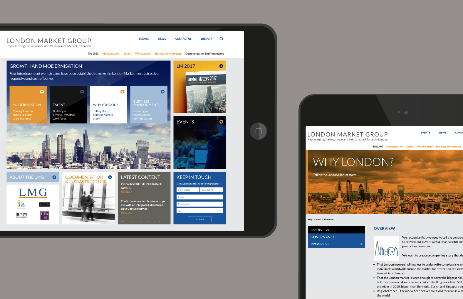
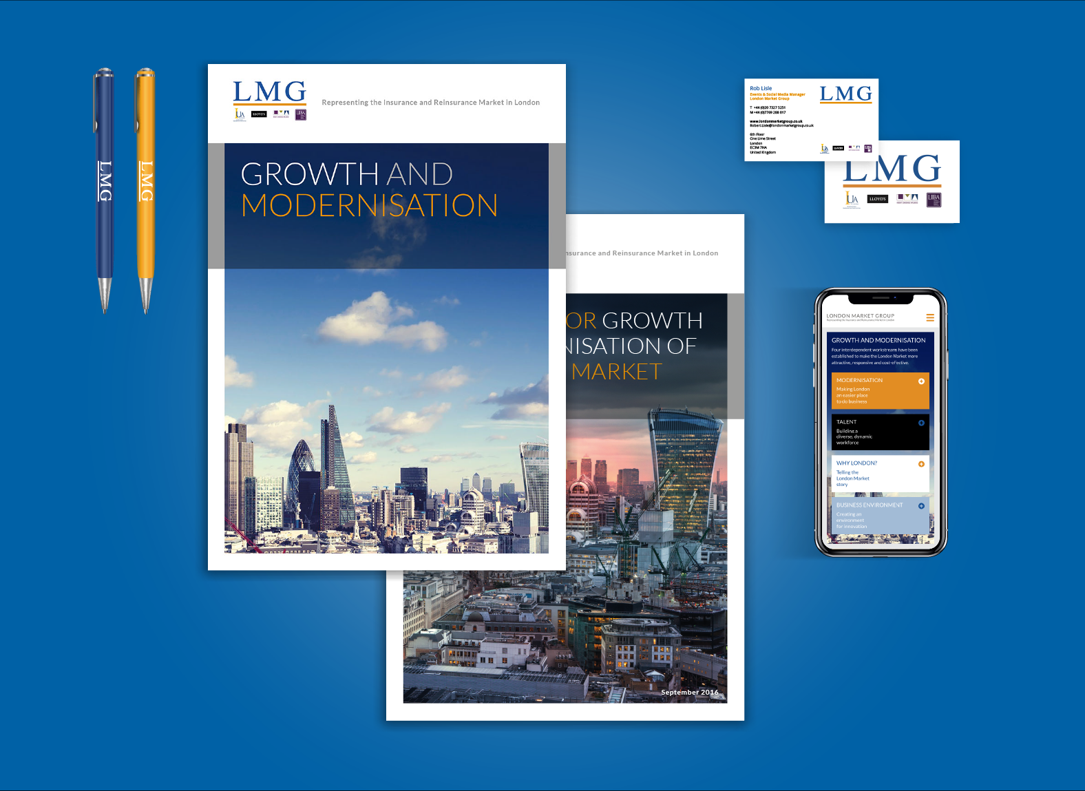
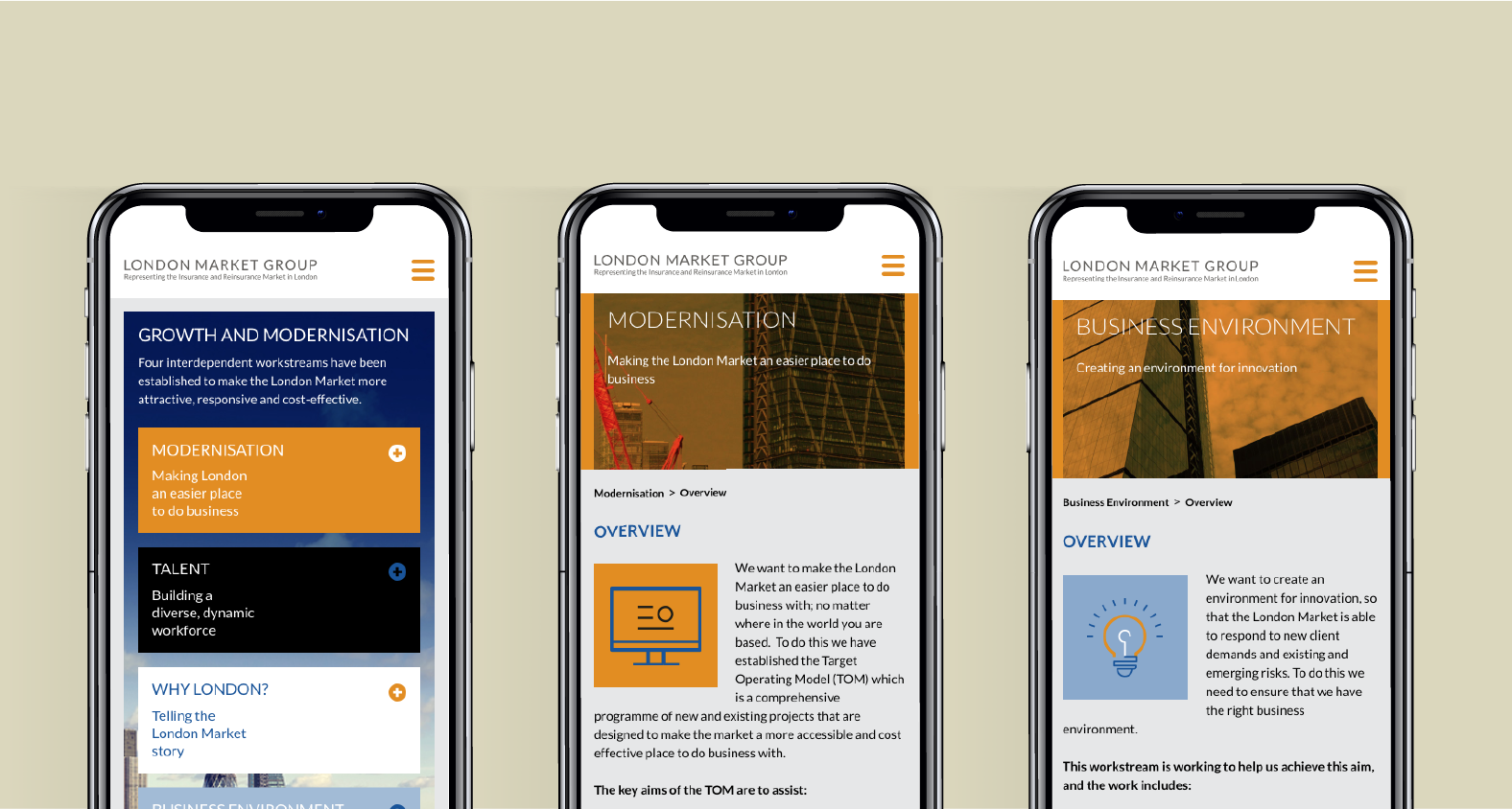
OB designed and built the LMG’s website (see website), whilst concurrently developing the LMG’s brand and applying it across their digital output. Thanks to our joined-up approach, we were able to manage the technical requirements of the project, hand in hand with the design aspects.
The LMG’s website is easy for the LMG team to manage and update; and for the global insurance market to access information efficiently. Our proprietary ‘Pebble’ web platform provides the speed and flexibility needed for future web demands.

challenge_Obscurity to clarity
The LMG required a new website. Firstly, the existing CMS was complex, which was creating a bottleneck for users when it came to content updates. This was proving frustrating to the LMG, not least because its key aim is to promote modernisation in the insurance market.
Secondly, LMG website visitors were finding the site tricky to navigate, which was proving a significant barrier to audience engagement.
This, again, was making it difficult for the LMG to promote itself as a representative of global excellence and encourage greater audience participation. They also wanted to provide enhanced features to visitors, including a document archive.
Thirdly, the LMG was struggling with the whole look and feel of the LMG brand. It was very much lacking in structure and coherence, making it difficult for the group to achieve any kind of consistency or recognition in the market.


Solution_design from the ground up
We began by auditing the structure and content of the LMG’s existing website, reviewing the entire UX.
As a result of our findings, we reorganised the website’s content and structure to make it more engaging and intuitive. We designed all the desired additional content, with sitemaps to reflect the various interested groups and initiatives.
Our aim was to make the website as accessible as possible for users, and the CMS equally user-friendly for the LMG’s editors.
Our in-house UX and UI designers worked seamlessly alongside our creatives and digital designers to create a website that not only worked effortlessly, but looked beautiful too. The O_B design team developed every aspect of the LMG’s branding for digital media. Having refreshed the LMG brand’s colour ways, fonts, imagery, look and feel, we then applied these to the LMG website.
In the interests of speed, reliability and security, we built the LMG website on Pebble, O_B’s proprietary system. As well as offering an affordable, high level of flexibility, Pebble is also SEO optimised.
results_simply elegant
The LMG’s now has a clearer, cleaner website that is far easier to navigate and brings the LMG’s brand to the fore. Having built the bespoke CMS from the ground up, we have also provided training to support LMG staff in updating content.
We continue to undertake ongoing maintenance on the site and we will be looking at adding video content and upgrading the site in the near future.
